Vivo da più di 10 anni in una località turistica, dove in estate le strade e i locali sono costellati di locandine, pannelli esterni, insegne, carte dei vini e menu. La concorrenza è spietata, a volte sleale, ma in ogni caso un posto cerca sempre di prevalere sul suo vicino – come è naturale che sia.
In this jungle of visual communication, one thing stands out more than anything else in the summer of 2026: ChatGPT. What used to be Word documents — or, for the more adventurous, Canva designs thrown together as best they could — have now turned into a sea of indistinguishable graphics that all look the same: the same fonts, the same color palettes, the same little explanatory icons. The result? Every place looks exactly like the one next door, and even if one of them charged half the price of its competitors, we probably wouldn’t even notice.
And just to be clear: this isn’t simply me “pleading my own case” because I happen to be a graphic designer by profession. It’s something I notice as a customer. Let me explain with an example (any resemblance to actual people or situations is purely coincidental — or perhaps not): I walk into a place and see an A4* sign on the counter that reads, “Fior di latte gelato with any toppings you like — €5.” I decide to buy it and leave. Then I walk into another place and see another A4 sign saying, “Customize your gelato with your favorite toppings — €5.” The font — the typeface — is the same, the colors are the same, and even the icons and graphic elements look very similar. What am I going to assume? That they have the same supplier, who must have given everyone the same promotional materials. Or perhaps that the same owner runs both places and sells the same product in each.
Cosa succede a questo punto? Il cliente non assocerà più quel determinato prodotto a quel locale: è un prodotto come un altro, posso prenderlo dappertutto. Il che sostanzialmente è vero, ma allora dovrebbe funzionare così per tutto ciò che è confezionato e rivenduto da più esercenti.
This discussion could go in countless directions, but I’ll choose just one — and perhaps I’ll have fun exploring the others another time: we like choosing something that feels exclusive. Our eyes are naturally drawn to whatever looks different from everything around it: a red flower in an entirely green field, the brightest star in the sky, the most colorful package on a wall of identical boxes. But in a field full of red poppies, are we really sure we can spot the most beautiful one? Under a mountain sky filled with stars, can we immediately pick out the brightest? And on a wall of identical packages, how do we find the product we like the most?
This is where graphic design — or, more specifically, branding** — comes into play: the art of making your product stand out from all the others. And here, too, we could open up an entirely new chapter of little things.
Let’s think it through: I need to design a sign for the very same fior di latte gelato, one for a small beach kiosk and one for an elegant beach bar. The clientele — what people in the industry call the target — couldn’t be more different. On one side, you have people coming straight from the beach in flip-flops and swimsuits, leaning an old ’80s beach umbrella against the table, dropping a cooler bag with half-melted ice packs onto a plastic chair, their hair still wet. On the other, you spot long lace and sequin kaftans at the entrance, linen shirts and straw Panama hats, crocheted handbags carefully placed on cushions covered in nautical fabric. On one side, someone simply wants something cold after a day by the sea; on the other, someone is looking for the perfect excuse to take a beautiful photo to post on social media***.
Even at the exact same price point, I can’t use the same communication strategy. I necessarily have to take the venue’s audience into account; otherwise, it would be like designing a poster in Japanese for a place frequented exclusively by Italians.
Provo a divertirmi un po’ con la grafica.
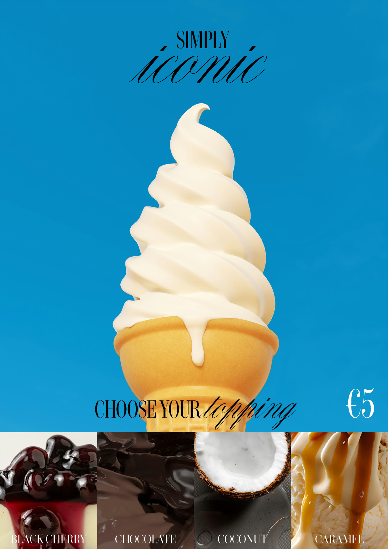
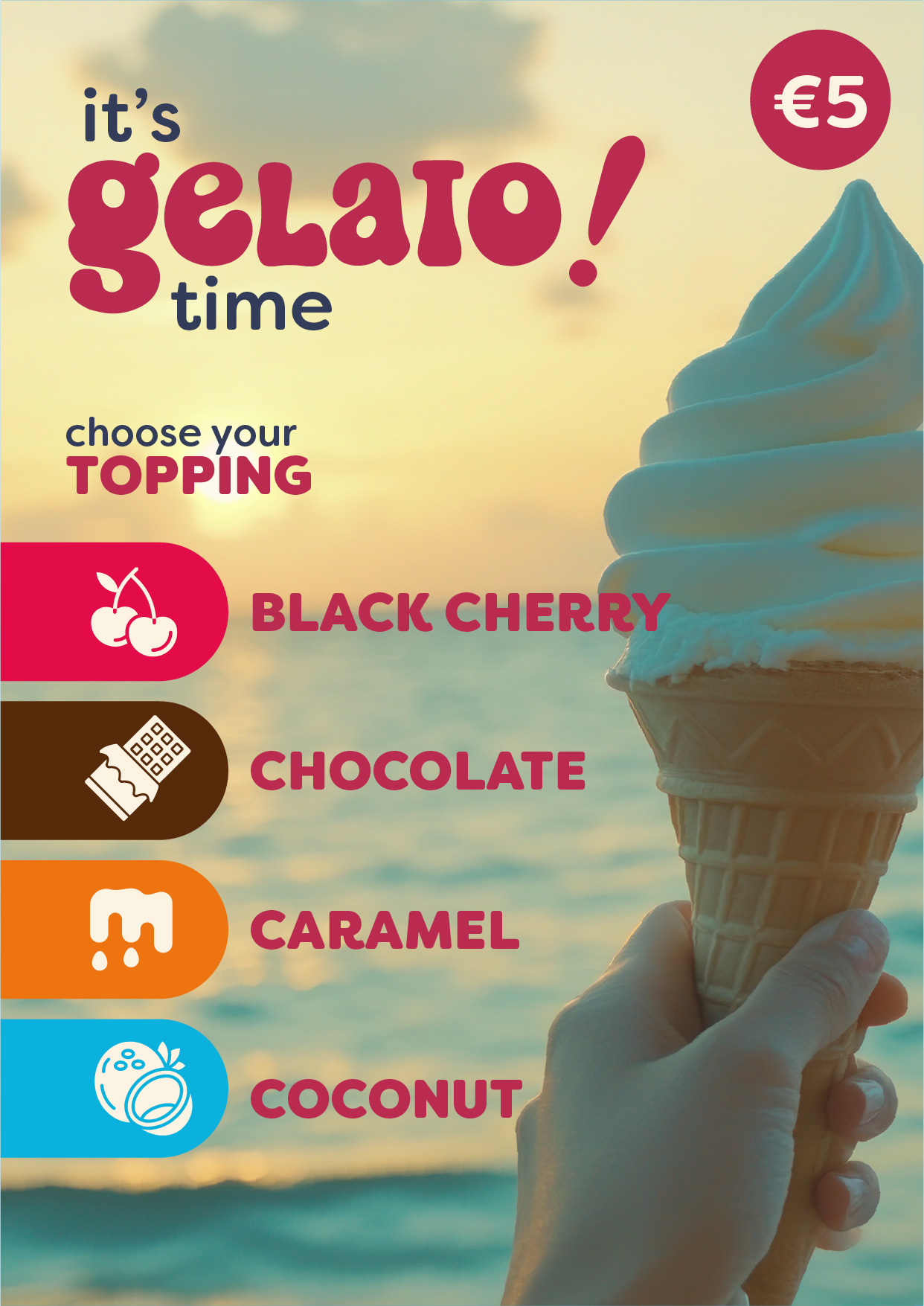
The product is exactly the same, and the venue’s logo is deliberately nowhere to be seen, yet you can immediately tell that these are two completely different places. On one side, we have straightforward communication, direct and to the point, aimed at someone who already wanted gelato and simply needed a reminder that now is the perfect time to enjoy it. On the other, we have evocative communication, where the product itself isn’t even mentioned — instead, I’m “selling” it to you as a status symbol.
Would we assume they have the same supplier? Probably not. We’d probably expect them to have two very different price points, too. And yet, it’s exactly the same product.
Ecco perché mi distrugge vedere queste grafiche sempre uguali. Perché non vedo più il pensiero, vedo una scelta fatta frettolosamente per mostrare un prodotto senza pensare a chi lo sceglierà, vedo la soddisfazione di creare qualcosa da un prompt e non da una ricerca, anche minima. Non voglio demonizzare l’Intelligenza Artificiale, che anche io utilizzo quotidianamente per alcuni lavori, è estremamente utile in tanti contesti. Ma non in questo, non per tutto.
So bring on the chaotic local festival flyers, packed with different fonts, pixelated logos, and photos taken in 1998.
Bring on the posters laid out in Word, and the text made with WordArt (does that still exist?).
Ben venga la creatività di chiunque si voglia fermare a pensare, mettendosi in gioco per realizzare qualcosa in prima persona.
Ben venga un’ora passata a realizzare due grafiche inutili per esprimere un concetto, e non essere comunque soddisfatti.
*Un A4 è il formato dei fogli più comune nelle stampanti casalinghe, misura 210x297mm.
** ‹brä′ndiṅ› s. ingl. [der. di brand «marchio»], usato in ital. al masch. – 1. Nel linguaggio della pubblicità, l’insieme delle attività di promozione del marchio di un’azienda: la politica di b. dei cartoni animati della Disney. Fonte: treccani.it
***Disclaimer: the example above isn’t simply a generalization. It’s based on a common practice in my line of work known as “defining user personas” — in other words, creating representative “ideal customers” to use as a reference point for every communication activity related to a particular venue.
One Response
Da un ammiratore: la pubblicità è sempre stata il fulcro del prodotto, infatti ad oggi mi basta ascoltare un brano musicale della mia prima giovinezza fine anni ‘80/‘90 e subito mi trasporta a un prodotto pubblicitario. A mio parere l’epoca della creatività pubblicitaria, del design e della musica quella bella di è fermata nei primi anni del
2000, poi è calato il gelo creativo che spinge tutti a uno standar e con l’avvento dell’intelligenza artificiale si è standardizzato tutto creando un disorientamento nella creatività umana.
Complimenti per il blog così umanamente intelligente